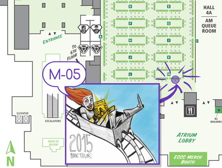
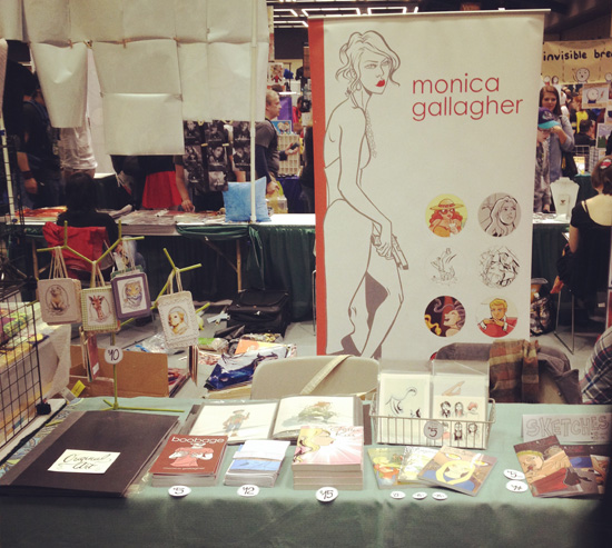
Ohhh it's table display time again! And this time, I fear, I'm a little squashed. Whereas I usually luxuriate my products across a six foot table space, I've got two conventions coming up (Stumptown and TCAF) where I fear I'll have to contain my madness to just three feet.
Thus, it's time for some planning. I start out by drawing a 3' long (half of an average 6' table space) x 2' deep space on the floor with some easily removable tape (you can also do this on a large enough table, if the person you live with doesn't violently object). Sometimes I fold up the tablecloth I plan on using and place it inside, to see if it clashes terribly with my books. But if I've used the same table cloth consistently without any problems (besides the occasional ink stain), I can skip using it.
Then comes the tricky part. It's not just about fitting everything into the space as you lay it on a table ...

But making sure to create levels of height in order to stagger appearance, catch the eye, and also - yeah - cram in as much stuff as possible.

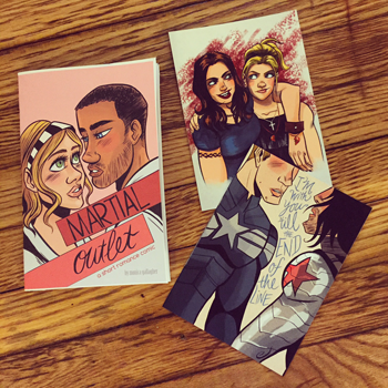
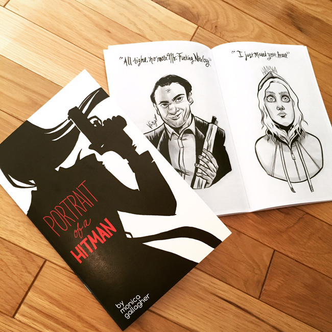
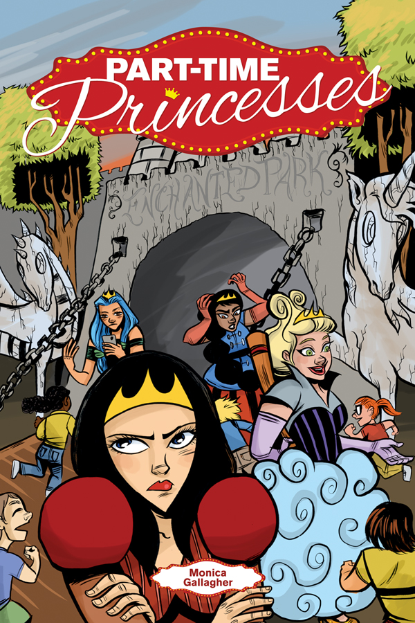
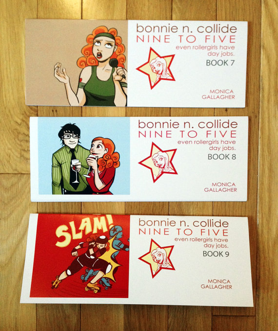
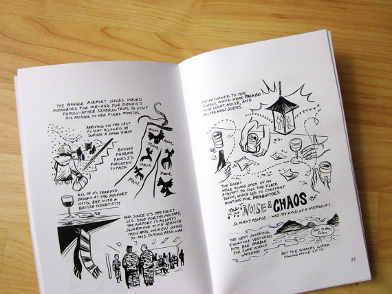
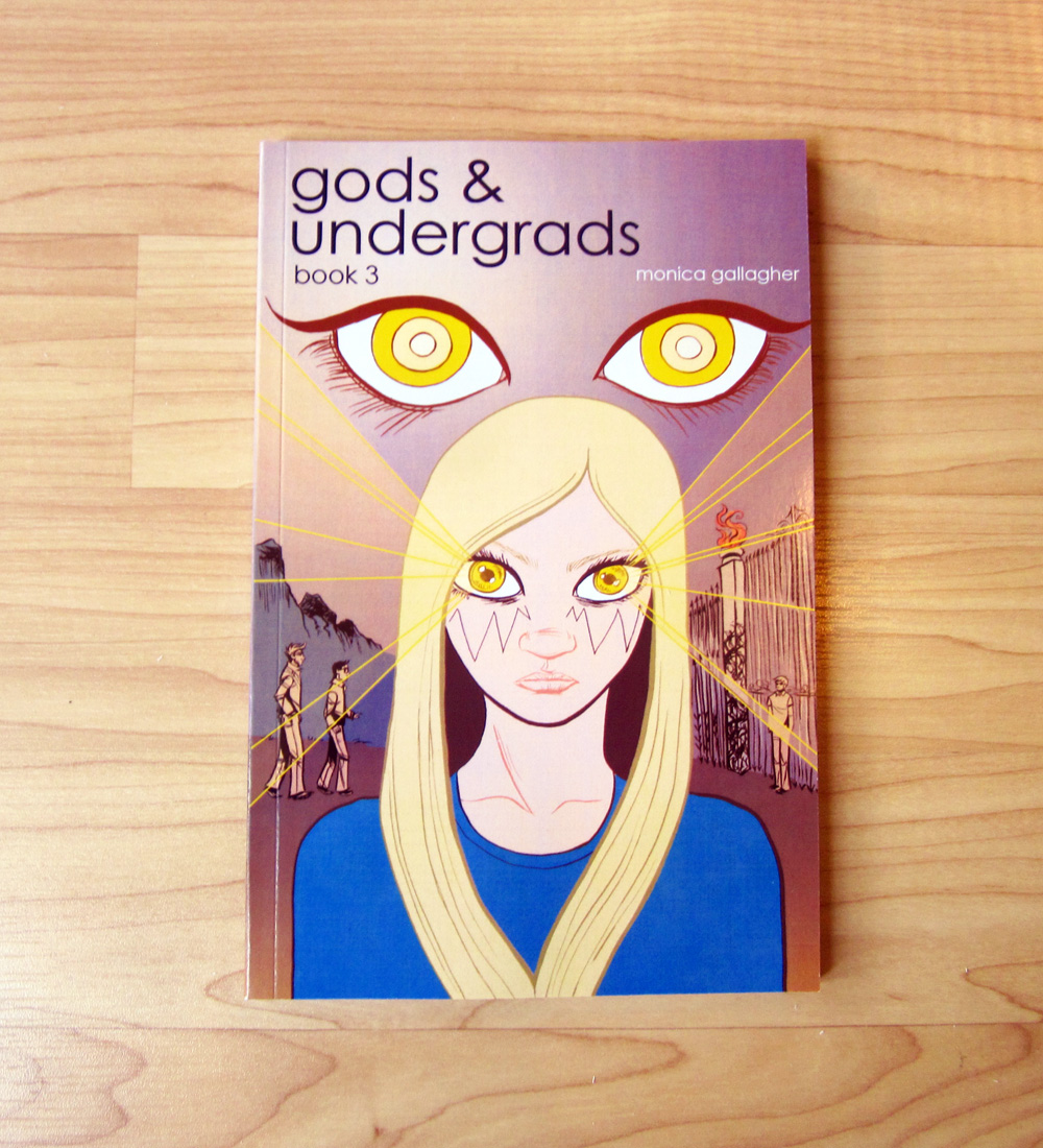
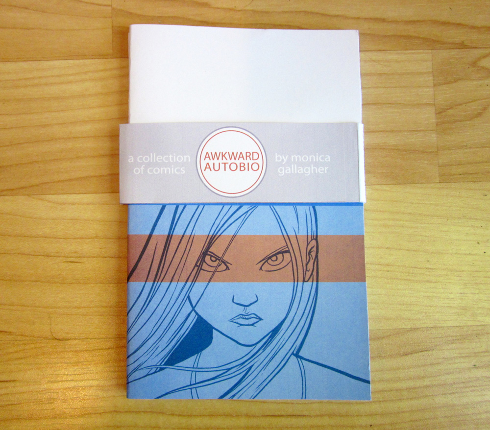
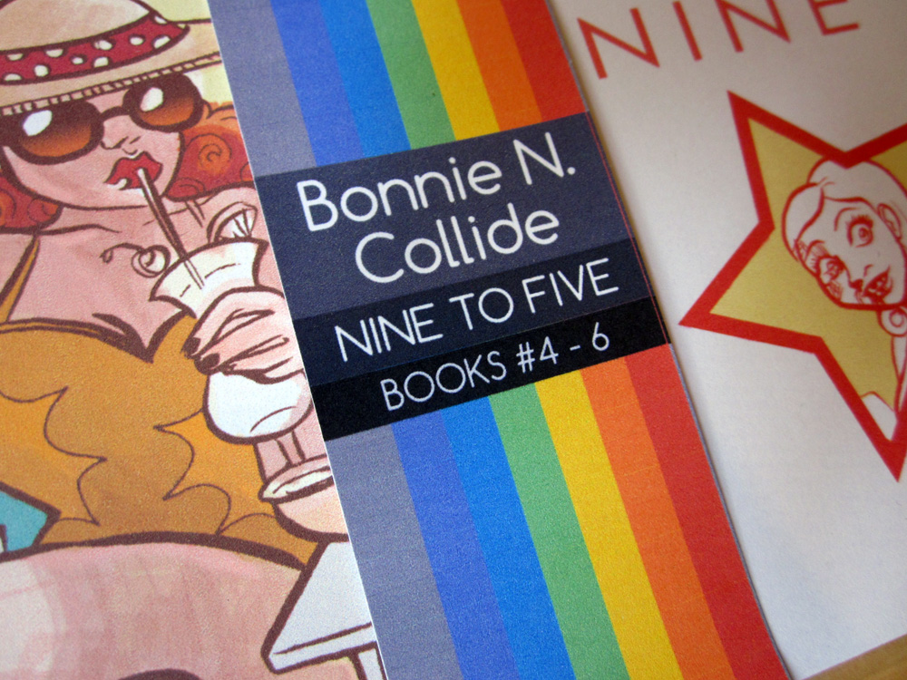
And since I have a lot of books, this gets a little crowded. I am a comics creator who has not one, but THREE ongoing series (Bonnie N. Collide, Gods & Undergrads, Lipstick & Malice), as well as autobiographical short stories (Boobage, Go For the Eyes, Mall Model, Middle School), and a new graphic novel (Glitter Kiss), I'm usually at a loss for how to compile and present everything. Do I age off some of my stories and stop bringing them along? Or do I condense them into cute packages?

Lately I've just been doing the latter, because I enjoy dabbling in packaging. But I've found presenting them in their packaging makes people reluctant to pick them up and unwrap them. So, the convenience of bundling them together becomes moot as I end up separating them anyway in order for people to flip through them.
What worries me the most about my gaggle of books, prints, cuffs, is that it doesn't seem very cohesive when viewed in a cluster like this. I can only do so much with uniform price stickers and labels. Plus there is something to be said for a good dosage of negative space.
Fellow comic exhibitors/craters/viewers of exhibit tables out there, what are you doing to conquer this problem? What do you like to see in a table? I think for now I'm going to keep incorporating some height (courtesy of these fine crates from Jo-Ann's) and fretting a little while longer.
[otw_is sidebar=otw-sidebar-4]


