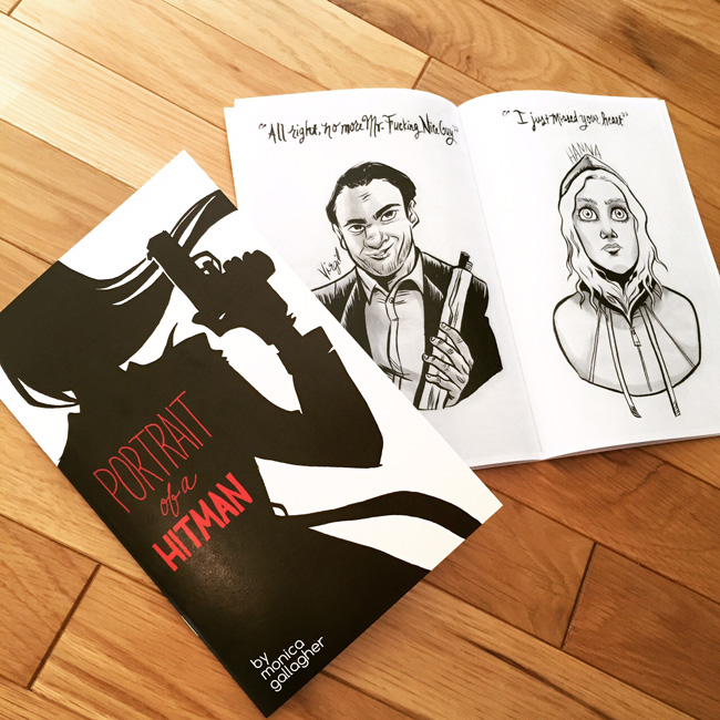
Woo! Still riding high on the fun that was Baltimore Comic Con this past weekend. This show is still one of my faves, not just because I live in dear ol' Bmore, but because it's the most diverse con I've still ever seen. People of all ages, backgrounds, costumed families, roving packs of preteens - it's pretty special. I get such warm squishes from seeing all the costumed folks bond with one another - "Hey aren't we in the Avengers together? FIST BUMPS!"
I was spoiled by all the familiar faces who returned to catch up and chat with me, and by being across from Locust Moon and their GIANTASTIC LITTLE NEMO ANTHOLOGY. Holy god - have you guys seen that thing? On Friday I thought it was a prop, but on Saturday I dared peek inside. No book can be that big and gorgeous, folks - no book.
And I got a lot of sketches to do - MY FAVORITE. I noticed after the fact that I drew almost ALL my ladies with their arms crossed in front of their boobs. What's that about? Should that be my thing now??


So now that SPX is looming on the horizon for this coming weekend, let's talk table displays! I like to mix things up at each convention, but I also like to figure out what works and what doesn't. Here was my table display for Baltimore:

I'm thinking it might be a little ... cluttered. Am I bringing too many different things? I feel like I either need to reduce/streamline my books and prints and things, or at least group them into different sections. Usually I think less is more, but then I get paranoid I'll leave out the one thing people might want to look at.
As exhibitors/visitors to conventions, what do you guys prefer? If I come up with anything special before SPX, I'll post it here and see if it made a difference.


