Pieces in Progress

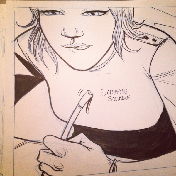
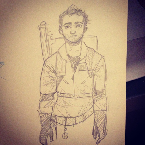
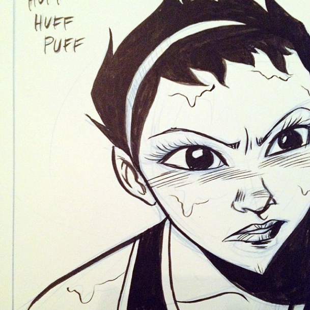
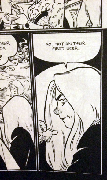
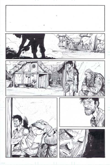
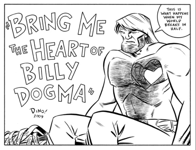
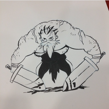
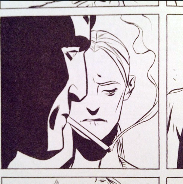
Just in case you guys don't already know this, since I'm working on a book for Oni in the background and I can't give you guys comics EVERY day (just Tue-Thu for Bonnie and Wed for my travel journal comic, which ain't too shabby!), I post a lot of my work in progress on my Instagrammers and Tumblrrrs pages. I'm always down for comments and questions on my process, tools, plans, whatevs! So feel free to chat.

Like this kinda stuff:

Come join the party!

[otw_is sidebar=otw-sidebar-4]

[otw_is sidebar=otw-sidebar-7]

Inking the New Hotness: Part 2

More talk about inking! Yes!

So, as I mentioned last time, for inking I use a size 6 Silver Ultra Mini brush and a pot of Bombay India Ink. Because I discovered I'd randomly bought them one day. One of the new challenges I've encountered with using a real brush is the ink usage. How much to put on your brush? When to blot? When to wash your brushes?


When I started using this brush, I quickly realized I'd need a blotter and a way to test out the line I was brushing before I got to the page. For me, using paper towels and a sheet of scrap paper was the easiest. Not the prettiest setup, but whatchagonnado.


Oh and I keep a roll of tape around my ink bottle for security, since this guy is always waiting for his opening.


Every time I dip my brush in the ink, I need to make sure the excess doesn't clumsily ruin all the nice lines I plan on doing. This works for the most part - I'm still working through when I'm allowed to make certain brushstrokes during the space between dipping my brush again. Swoopy lines tend to happen for me right after I dip and blot, but thin, controlled lines have to wait until after a lot of the ink has left the brush.


Purposefully scratchy lines are something I'm still working on - for me I haven't quite found the right balance of ink and control to get them just right. I love the inbetween, gray texture of them though.


Mostly I tend to probably OVER dip, or put too much ink on my brush. That's pretty much how I solve every inking problem - it's like a reset button for me. Line getting too weak? RESET, GIMME MORE INK. Brush seeming to diverge into uncontrollable side lines? RESET.

This here is one of my biggest pet peeves:


The dreaded brush off-shoot. You know, where suddenly one or two hairs on your brush decide they're NOT all in it together and decide to go their separate ways. Then, just when you think you're inking one solid, has-it-together line - BAM - a tiny twin line appears, just to mock you.

I used to think this meant I needed a new brush, or needed to wash it out more frequently. I'm still not exactly sure what the cause is, but naturally my solution is RESET. MORE INK STAT.

Then I feel more comfortable ignoring the problem, because it's slathered down with more ink, less likely to cause trouble if I keep weighing it down.


This can get a little messy. And because of my tendency to over-ink, I've taken to washing my brush out after each page  just to start fresh once again. Or if my line starts getting really out of hand and acting out on me, I'll wash my brush to see if it helps.


Now, since I am a novice at inking technique, and a super novice at using a brush, I'd love to hear how YOU guys are going about it. Are you washing your brushes all the time? Replacing them all the time? Using different sizes, or one size like me? I'm especially curious to hear whether or not you plop your brushes in soapy water during your inking - I've been wondering if that would solve my split personality brush hair problem.

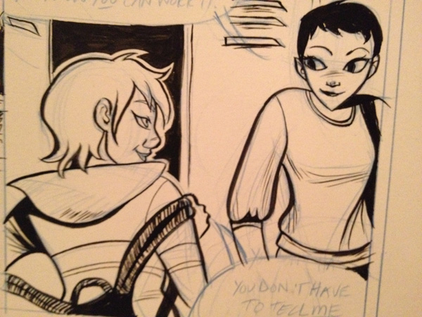
All these inking samples are taken from my webcomic Gods & Undergrads, and the book I'm currently working on for Oni. :)

Other posts about inking: Inking the New Hotness Part 3 Inking the New Hotness Part 1

[otw_is sidebar=otw-sidebar-4]

[otw_is sidebar=otw-sidebar-7]

Inking the New Hotness: Part 1

I've been doing a LOT of inking lately and I think I'm in love with it. A couple of months ago, I  switched over from only using my beloved Pentel Brush Pen to using a tiny brush and a pot of India Ink.

Inking used to be one part of the Comics Process Trinity that I liked okay (because at least the pencilling was over with), but I was always disappointed with the lack of control I felt. Lines that looked so cool in pencil were suddenly ruined by the shaky, fat line that completely surprised me when I drew it on the page.

The smaller brush seems to have made a huge difference in giving me more control in line weight and distribution of ink. It took some adjustment at first to get used to holding a thinner drawing instrument (welcome back, carpal tunnel!), but now I wouldn't have it any other way. I even tried to get slightly larger brushes of the same style - #8 and #10 - but #6 remains my jam.

I'm a total inking novice, so I wanted to do a couple posts on my newfound love of it and how I'm (hopefully) learning to improve upon my process. New exciting tools that make me excited to do it - CHECK!

Inspiration is also a huge kick in the pants of making we want to improve, too. Here are a few of the folks whose inking stylings I'm super crushing on:

Other posts about inking: Inking the New Hotness Part 3 Inking the New Hotness Part 2

[otw_is sidebar=otw-sidebar-4]

[otw_is sidebar=otw-sidebar-7]

Maximizing the Space

Ohhh it's table display time again! And this time, I fear, I'm a little squashed. Whereas I usually luxuriate my products across a six foot table space, I've got two conventions coming up (Stumptown and TCAF) where I fear I'll have to contain my madness to just three feet.

Thus, it's time for some planning. I start out by drawing a 3' long (half of an average 6' table space) x 2' deep space on the floor with some easily removable tape (you can also do this on a large enough table, if the person you live with doesn't violently object). Sometimes I fold up the tablecloth I plan on using and place it inside, to see if it clashes terribly with my books. But if I've used the same table cloth consistently without any problems (besides the occasional ink stain), I can skip using it.

Then comes the tricky part. It's not just about fitting everything into the space as you lay it on a table ...


But making sure to create levels of height in order to stagger appearance, catch the eye, and also - yeah - cram in as much stuff as possible.


And since I have a lot of books, this gets a little crowded. I am a comics creator who has not one, but THREE ongoing series (Bonnie N. Collide, Gods & Undergrads, Lipstick & Malice), as well as autobiographical short stories (Boobage, Go For the Eyes, Mall Model, Middle School), and a new graphic novel (Glitter Kiss), I'm usually at a loss for how to compile and present everything. Do I age off some of my stories and stop bringing them along? Or do I condense them into cute packages?

Lately I've just been doing the latter, because I enjoy dabbling in packaging. But I've found presenting them in their packaging makes people reluctant to pick them up and unwrap them. So, the convenience of bundling them together becomes moot as I end up separating them anyway in order for people to flip through them.

What worries me the most about my gaggle of books, prints, cuffs, is that it doesn't seem very cohesive when viewed in a cluster like this. I can only do so much with uniform price stickers and labels. Plus there is something to be said for a good dosage of negative space.

Fellow comic exhibitors/craters/viewers of exhibit tables out there, what are you doing to conquer this problem? What do you like to see in a table? I think for now I'm going to keep incorporating some height (courtesy of these fine crates from Jo-Ann's) and fretting a little while longer.


[otw_is sidebar=otw-sidebar-4]

[otw_is sidebar=otw-sidebar-7]

Webcomic Week Day 5: The Weak Spots

Okay, here we go. Let's do this. Let's talk about the areas that I really hate drawing, therefore suck the most when I draw them - aka my weak spots.

As you can tell from this picture, my weak spots are most definitely backgrounds. A lot of artists have areas they particularly dread drawing. Some are hand-phobes, other face-phobes, I am a background-phobe. Filling backgrounds with people and objects and *shudder* perspective never ceases to paralyze me. As you can tell from these next few shots, the beginning of Gods & Undergrads was chock full of poorly planned, horribly executed backgrounds that I really gave a crap about and boy does the sloppiness show ...

Everything I drew seemed like it's own little lesson in What Not To Do as an artist. If there was a comic equivalent of Stacey & Clinton, they would haul me off to New York and give me an illustration renovation STAT. Actually . . . who would the comic makeover king and queen of the comics world be? I already have a list going of the hottest comickers. But the ones with the ability to makeover others? Hmm. I smell an industry need, waiting to be filled ...

Anyway. So why am I showing you multiple examples of horrible drawing in my own book? Because when you create any comic, or webcomic, or story, or art, or what have you, it's important to face your fears. Sure, I did a lot of terrible backgrounds (and still do sometimes), but like with the writing, I kept doing them until they gradually got better. Look, at the end of the first book the backgrounds had already improved:

And by the second book? LIGHTYEARS better.

I'm not saying I don't still have loads of work ahead of me in the Backgrounds Arena. But once I realized that backgrounds were just as much an important part of the story as the facial expressions, the color, the dialogue, the outfits, etc. the comic started to evolve just from being an amateur mish-mash into an actual evolving style. One I didn't plan on, but one that was slowly becoming more cohesive.

Last year, when I started illustrating my first graphic novel for a publisher, my editor gave me some notes on how all of my panel compositions were starting to look the same - headshots, waist up shots, ALL people, all the time. My old nemesis was creeping up on me and not only making me steer clear from drawing backgrounds, but skewing the page layouts of the book too. So was I going to take that shit from backgrounds? Oh hell no. Sure, perspective still boggles my mind and dressing a scene can cause me to break out into cold sweats, but with a little patience, a lot of stress coffee drinking, and this book:

it's gotten MUCH better.

Webcomic Week Day 4: Planning vs. Evolution

Yep, it's not really Day 4, since Webcomic Week started last week ... oh well, continuity blows! ... Aaaand also happens to be the topic of this post. I've been writing terrible stories since I was little. Luckily I didn't let that deter me. I had a screenwriting teacher in college who told us flat out:

Everything you write will be shit.

And she was spot on. But luckily she added:

If you keep writing, it will become less shitty.

That's the motto I've clung to over my years of writing several short comic stories and one looooooong comic story. If I keep writing, in theory the writing gets better. Or, rather, it gets less shitty. I used to think when you wrote out a story, you had to plan everything in advance before you started drawing. This thought managed to paralyze me and prevent me from ever writing fully fleshed out stories. When I started Gods & Undergrads, my detailed plot points looked like this:

  • There is a girl.
  • She is the off-spring of some gods and stuff.
  • She's going to be at college doing college-y things.
  • Now and again a god will come in and mess everything up.
  • The end.

The inbetweens I wasn't able to quite figure out until I started writing the story. Occasionally I'd randomly decide upon bigger events I wanted to happen (she breaks her arm, Furies are called, etc.) and then would be able to steer the story in those specific directions. Sometimes I worried that all I was doing was spinning my wheels and putting in filler between big, random events. I kept thinking my job as a writer was to keep the reader occupied and unassuming until BAM! The next plot point came around.

Unfortunately, this resulted in a lot of my earlier (okay, truthfully, and current) work occasionally slogging through some slow parts. In these slogs, nothing much happens plot-wise, but at least the characters do take the opportunity to become more developed and separate their personalities from one another. Intially created out of laziness, over time I realized this truly was a storytelling preference of mine. I gravitate towards stories with a sloooowwww burn, all build up and pretense and atmosphere. And most of the time I don't even care if there's a BAM ending (or hell, even an ending at all), I just like to sit and immerse myself in that world for a little while. To me, it adds to the experience of getting into a story. Mm, maybe half that and half laziness.

Over the years my haphazard storytelling method has had to evolve, and I've developed a system I'm pretty comfortable with.

  1. The story idea arrives (usually in the car, or during a meeting, or some other time when I'm generally supposed to be otherwise engaged)
  2. I jot down notes, sketches, snippets of dialogue - whatever keeps me thinking of the idea
  3. I start to storyboard (I go into this process in further detail here), and depending on whether or not I have a deadline, I'll do this right away or take my time
  4. I back WAY the hell off
  5. I return to storyboarding
  6. Repeat steps four and five

Step 4 is what saves me from getting stuck in a story rut or getting bored or throwing shit in the story just to fill it out. I find that if I just physically leave my work, my mind kicks into gear and comes up with way better stuff than if I'd still been sitting there, staring at the paper. The same theory works for me when I draw my pages - if I'm getting bogged down, feeling uninspired, have no clue how to draw this next thing - LEAVE THE DESK. I go get some coffee or candy or let my cat attack me. As the Ghost Hunters say (that's right, I referenced them): When in doubt, get the hell out.

So whether your method is of the JK Rowling variety (I can't even fathom the amount of detail she has in her notebooks) or if you're like me and have trouble staring at Big Scary Story's Monster Face all at once, there is a method for you. I find the best way to keep yourself motivated is to lean toward your strengths. Do whatever you need to to keep yourself going and being excited about the idea. If you're no longer excited, switch gears and try something else. Or go let a cat attack you.

Webcomic Week Day 3

Webcomic Week Day 2

Webcomic Week Day 1

Book Cover Experiment

One way I've decided to save space at this convention is to combine each of my comic book series into cute little packs. For example, since I have three Lipstick & Malice's for sale, I'm going to sell them as a cute triple pack instead of individually, hence taking up less room on my table. I can do the same for Bonnie N. Collide (three of those) and Gods & Undergrads (two of those).  But how to bind them together?

Over the years and conventions, I've seen a couple of cute ways to bind several books of a series together. But frankly - I haven't got much time and I'm not very gifted in the crafty. So I decided (as is my custom) to just haphazardly try something out and see if it worked. Here goes ...

First, I got the books together I wanted to combine.

Then I started out by wrapping a plain piece of cardstock around them to see how it would look.

Since that seemed wayyyy too big (since it's 8 1/2" x 11"), I thought I'd try out what half of a sheet of paper would look like when wrapped around my books.

This was better, but I still felt like it was a tad big, so I halved it again, ending up with a 1/4 sheet of paper.

So I wrapped it around, testing out the size, and started to make sketches of the design I wanted to put on it.

I punched a hole where the two ends overlapped, giving me something that would (hopefully) hold the wrapper in place.

Now that I had roughly the dimensions I needed my wrapper to be, I sketched light pencil lines where the creases were ....

And scanned the scrap of paper in, sketches and all. This gave me a template to use for creating a more polished looking design in Photoshop.

I used the pencil lines as guidelines for where to keep my edges. And when it was done, I printed it out - 4 to a page (since I made mine 1/4 the size of a piece of paper), printed on cardstock with the settings to "borderless printing".

Now that I had it printed and cut up, I punched holes in the wrapper.

And wrapped it around my books to make sure it still fit okay.

Then, for flare, since you can never have enough flare ... I cut a piece of ribbon out to thread through the punched holes.

And tied a neat little bow. So - voila! There you have it - a tiny little book sleeve for a 3-pack series of books, all totally possible to recreate yourself.


My Comics Process: Table Preparation

As I'm sitting here, frantically alternately printing out books for my upcoming convention and replacing paper/ink cartridges, I'm starting to think about how to best display my work at said convention. I've already shown some of the ways I've displayed books in the past, but every show is always a wee bit different. For this show, one of my big challenges will be the size of the table space I'll have:


I'll be sharing a 6-foot table with two other comickers, so that leaves me with about 2-feet x 2-feet space for li'l old me. Considering that at my last convention, I had an 8-foot table to myself, I'm going to need to do some creative re-working of my products.

First, what am I even bringing along to sell? There are some books:

... And then there are some prints.


Now, clearly there isn't enough room to lay everything out flat - I'll have to start combining some things. I'll also need some good display items - racks, stands, what have you. Over the years I've dabbled in some different options, but so far I seem to have only these at my disposal, currently:

Hmm. I might need to hit up Michael's this week and see what else I can find. Stay tuned for the next installment - how on earth do I fit what I have into the space provided??

My Comics Process: Computerizing

And now, for the next step in my Comics Process (this process seems really long, doesn't it?): Computerizing! This is going to be pretty mind-numbingly detailed in terms of what to click next, so make sure your caffeine is at the ready.

First, I scan my inked page.

Because I have a regular-sized scanner (this one in fact), I have to scan my page in 2 pieces.

Next, I open my scanned pages with Adobe Photoshop. I use Photoshop for the computerizing process mainly because it's something I've become so accustomed to doing, so therefore it's fastest for me. Over the years I've come to know Illustrator and InDesign better, and I know other comickers have other programs they prefer, which are probably better to use for this kind of thing. So just as a disclaimer - I use Photoshop because at this point I can use it faster than I can other programs. Anyhoo.

My page comes in 2 pieces, so I need to rotate my images and combine them into one page. I go to the top menu > Image > Rotate Canvas to get each part facing the right side up. Then I pick one of the halves and go to Image > Canvas Size.

I set the height of the page to 14 inches, because that was the size of my original paper. I select the other half of  my page, copy and paste it into this one, and fiddle around with the layer until they match up. Then I combine them into one image by going to Image > Merge Visible.

Next, I need to put borders around all of my panels, since I didn't ink them in. I select the Rectangle Tool from the handy toolbar and draw one big rectangle along the outside of my entire page.

Then, I go to the Layers Panel and set the fill of the rectangle to 0%, so the rectangle is transparent. Then I add a Layer Style to the rectangle - a stroke 12 pixels thick, which gives us the panel outline.

Now that the outside of all of the panels is marked, I need to separate each panel border. Using the rectangular marquee tool, I draw rectangles for all the gutter spaces (in between the panels). Make sure when you use the rectangular marquee, you've clicked the Add to Selection button so that all of your selection is included.

Next, go to top menu > Select > Inverse. Then, back in the Layers Panel, click the Add Layer Mask button.

Voila - by drawing that one big rectangle and cutting out the parts I didn't want, I've successfully created all of my panel borders for the page.

The next step is going to be adding text. Since my scanned image carries traces of my blue pencil, I can still see the word bubbles and what text I want to type in on the page. Now, you have some choices when you're adding text in on the computer. I would beg you, however, not to use Comic Sans as a font. It's been used everywhere, it's tacky, and it's a bit ugly. There, I said it. Besides that, I would say it's up to you what you choose for a font. However, in my opinion, one of the best things you can do if you're not hand-lettering (or getting a professional to do it for you) is to create your own font. Even though I'm terrible at drawing fonts by hand myself, I struggled through the process and managed to come up with one that isn't horrible, is legible, and 100% reflects me and my style. I used this font creator back in the day ... like, at least 9 years ago when I created my font. Yeesh. I'm old.

So, using my font, I type over the word bubbles on the page. For words I want to emphasize, I select the text and go to the Character panel and hit the Faux Bold or Faux Italic buttons. When I created my own font, I created a "bold" version of it too, but I usually prefer to use the Faux Bold instead of my own font (again - not gifted at font creation).

Now that all the text is in, I can create the word bubbles to go around them. For this, I go to my Shapes Tool and select Rounded Rectangle. I set the radius (curvy-ness of the shape edges) to 50 pixels.

After I've dragged rounded rectangles behind each of my text bubbles (make sure to set the properties of the rounded rectangle tool to Add to Shape Area so the shapes all end up on one layer), I can create the stem that points the bubbles to the speaker. For this, I select the Pen Tool.

Using the Pen Tool, I select the rounded rectangles layer in my Layers Panel, again making sure the selection properties on the top panel are sent to Add to Shape Area. What this does is insure that the stems I create with the pen tool will be treated as part of the same shape as the rounded rectangle, so there won't be any lines or separation between the word bubble and the stem coming off of it.

Now, a word on word bubbles .... I don't terribly like the way I do them. In fact, I tend to prefer word bubbles that look more like this:

(This page is taken from Hopeless Savages #3 from Oni Press, art by my fave Christine Norrie, story by Jen Van Meter, lettering credited by Christine Norrie, Andy Lis, Jamie McKelvie, Tom Orzechowski, Bryan Lee O'Malley)


So this is something I definitely need to work on.

Next - on to getting rid of the pesky blue pencil marks. I forget who exactly I got this process from first, but it's proven to be quick and handy, so I thank them! With your artwork layer selected, go to Image > Adjustments > Hue/Saturation.

Select the Blues and set the Lightness to 100. Repeat the process with the Cyans selected.

Now, your blues are gone but your inking still looks a little ... drab. I little bit less than pure black, doesn't it? Easy fix. Go to Image > Adjustments > Threshold.

And hit OK.

That should bump up the contrast of your inks to a nice level.

So there you have it - the whole page!

Now, for follow-on things you can do - to get rid of the lines that go outside the panel borders, select your panel layer (the one with all the black panel borders) in the Layers Panel, right-click on its mask selection, and select Subtract Layer Mask from Selection. Apply this selection as a mask to the layer your artwork is on. Also, you'll need to select the outside border of your panels and go to Select > Inverse. Select your artwork layer again and go to Select > Save Selection > Channel > Shape 1 Mask > Operation > Subtract from Panel. What all of this does is mask your artwork layer to be within the same boundaries as your panel borders - i.e. none of your lines will bleed outside of the panel border lines.

Still awake? You've made it through my computerization process! Yay! Now, there's all kinds of places you can go next - adding grays to the page, color, etc. However, my page is going to stay this simple for now, as you can see posted here. If anyone has any further tips, suggestions, preferences on this process, lemme know! Let's have share time. :)

Past Parts:

My Comics Process Part 1: Thumbnailing

My Comic Process Part 2: Pencilling

My Comics Process Part 3: Inking

[otw_is sidebar=otw-sidebar-4]
[otw_is sidebar=otw-sidebar-7]

My Comics Process: Computerizing

And now, for the next step in my Comics Process (this process seems really long, doesn't it?): Computerizing! This is going to be pretty mind-numbingly detailed in terms of what to click next, so make sure your caffeine is at the ready.

First, I scan my inked page.

Because I have a regular-sized scanner (this one in fact), I have to scan my page in 2 pieces.

Next, I open my scanned pages with Adobe Photoshop. I use Photoshop for the computerizing process mainly because it's something I've become so accustomed to doing, so therefore it's fastest for me. Over the years I've come to know Illustrator and InDesign better, and I know other comickers have other programs they prefer, which are probably better to use for this kind of thing. So just as a disclaimer - I use Photoshop because at this point I can use it faster than I can other programs. Anyhoo.

My page comes in 2 pieces, so I need to rotate my images and combine them into one page. I go to the top menu > Image > Rotate Canvas to get each part facing the right side up. Then I pick one of the halves and go to Image > Canvas Size.

I set the height of the page to 14 inches, because that was the size of my original paper. I select the other half of  my page, copy and paste it into this one, and fiddle around with the layer until they match up. Then I combine them into one image by going to Image > Merge Visible.

Next, I need to put borders around all of my panels, since I didn't ink them in. I select the Rectangle Tool from the handy toolbar and draw one big rectangle along the outside of my entire page.

Then, I go to the Layers Panel and set the fill of the rectangle to 0%, so the rectangle is transparent. Then I add a Layer Style to the rectangle - a stroke 12 pixels thick, which gives us the panel outline.

Now that the outside of all of the panels is marked, I need to separate each panel border. Using the rectangular marquee tool, I draw rectangles for all the gutter spaces (in between the panels). Make sure when you use the rectangular marquee, you've clicked the Add to Selection button so that all of your selection is included.

Next, go to top menu > Select > Inverse. Then, back in the Layers Panel, click the Add Layer Mask button.

Voila - by drawing that one big rectangle and cutting out the parts I didn't want, I've successfully created all of my panel borders for the page.

The next step is going to be adding text. Since my scanned image carries traces of my blue pencil, I can still see the word bubbles and what text I want to type in on the page. Now, you have some choices when you're adding text in on the computer. I would beg you, however, not to use Comic Sans as a font. It's been used everywhere, it's tacky, and it's a bit ugly. There, I said it. Besides that, I would say it's up to you what you choose for a font. However, in my opinion, one of the best things you can do if you're not hand-lettering (or getting a professional to do it for you) is to create your own font. Even though I'm terrible at drawing fonts by hand myself, I struggled through the process and managed to come up with one that isn't horrible, is legible, and 100% reflects me and my style. I used this font creator back in the day ... like, at least 9 years ago when I created my font. Yeesh. I'm old.

So, using my font, I type over the word bubbles on the page. For words I want to emphasize, I select the text and go to the Character panel and hit the Faux Bold or Faux Italic buttons. When I created my own font, I created a "bold" version of it too, but I usually prefer to use the Faux Bold instead of my own font (again - not gifted at font creation).

Now that all the text is in, I can create the word bubbles to go around them. For this, I go to my Shapes Tool and select Rounded Rectangle. I set the radius (curvy-ness of the shape edges) to 50 pixels.

After I've dragged rounded rectangles behind each of my text bubbles (make sure to set the properties of the rounded rectangle tool to Add to Shape Area so the shapes all end up on one layer), I can create the stem that points the bubbles to the speaker. For this, I select the Pen Tool.

Using the Pen Tool, I select the rounded rectangles layer in my Layers Panel, again making sure the selection properties on the top panel are sent to Add to Shape Area. What this does is insure that the stems I create with the pen tool will be treated as part of the same shape as the rounded rectangle, so there won't be any lines or separation between the word bubble and the stem coming off of it.

Now, a word on word bubbles .... I don't terribly like the way I do them. In fact, I tend to prefer word bubbles that look more like this:

(This page is taken from Hopeless Savages #3 from Oni Press, art by my fave Christine Norrie, story by Jen Van Meter, lettering credited by Christine Norrie, Andy Lis, Jamie McKelvie, Tom Orzechowski, Bryan Lee O'Malley)


So this is something I definitely need to work on.

Next - on to getting rid of the pesky blue pencil marks. I forget who exactly I got this process from first, but it's proven to be quick and handy, so I thank them! With your artwork layer selected, go to Image > Adjustments > Hue/Saturation.

Select the Blues and set the Lightness to 100. Repeat the process with the Cyans selected.

Now, your blues are gone but your inking still looks a little ... drab. I little bit less than pure black, doesn't it? Easy fix. Go to Image > Adjustments > Threshold.

And hit OK.

That should bump up the contrast of your inks to a nice level.

So there you have it - the whole page!

Now, for follow-on things you can do - to get rid of the lines that go outside the panel borders, select your panel layer (the one with all the black panel borders) in the Layers Panel, right-click on its mask selection, and select Subtract Layer Mask from Selection. Apply this selection as a mask to the layer your artwork is on. Also, you'll need to select the outside border of your panels and go to Select > Inverse. Select your artwork layer again and go to Select > Save Selection > Channel > Shape 1 Mask > Operation > Subtract from Panel. What all of this does is mask your artwork layer to be within the same boundaries as your panel borders - i.e. none of your lines will bleed outside of the panel border lines.

Still awake? You've made it through my computerization process! Yay! Now, there's all kinds of places you can go next - adding grays to the page, color, etc. However, my page is going to stay this simple for now, as you can see posted here. If anyone has any further tips, suggestions, preferences on this process, lemme know! Let's have share time. :)

Past Parts:

My Comics Process Part 1: Thumbnailing

My Comic Process Part 2: Pencilling

My Comics Process Part 3: Inking

[otw_is sidebar=otw-sidebar-4]
[otw_is sidebar=otw-sidebar-7]

My Comics Process: Inking

It's time for Part 3 of my Comics Making Process - Inking!

When we last left off we had a page all pencilled, waiting for some ink:

So I gather together all my favorite inking tools. I prefer the Pentel Brush Pen, and Microns of various sizes. The Pentel is a fairly recent obsession of mine (and by fairly recent, I mean since 2008, when I started using it), recommended to me by the incomparable Chris Schweizer. Finally, a brush pen that kept its fine point for months, even years after purchasing! It was a bit of a learning curve at first, and occasionally my hand will still spazz out and give everything a thick line, but overall I loooooves it.

Okay, so I've got my inking tools and my page to be inked. Now depending on the contents of the page, I'll use one of the Microns and a ruler first in order to block out all of the architecture - basically anything requiring a straight line. Sometimes I'll go over lines without the use of a ruler, which, for me, is almost always a mistake. (I've got those blasted coffee hands - all a-jittery)

This might be common sense, but I try to ink from the upper left hand corner of each panel down to the lower right hand corner so I limit my ink smudging as much as possible. Apart from the straight-line items on the page, I'll use the Microns for anything tinier or more precise than I trust myself to be able to do with the brush pen.

Now, with inking (depending on how you eventually finalize each page), you have a chance to really add some good shadows and depth. Pay attention to what time of day it is in your scene, where the light sources would be coming from, etc. In my earlier comicking days, I tended to shade everyone equally, as if there were a little sun hanging directly over each and every character. I didn't really get that I had to create a whole environment for my characters to be running around in, I couldn't just light them all individually. Anyhoo.

Now for this page, you can see I didn't play too much with shadows and contrasty lighting. In the past, I've colored my Gods & Undergrads pages. Recently I haven't had enough time to fully color each page, so I've been doing them in straight black-and-white. However, since I one day hope to color them, I don't add as much depth with my inking as I would if this were closer to the finished product. Also, you'll notice I've left the borders of the panels as-is - no inking by hand. I'll leave that for Part 4 - Computerizing!

My Comics Process Part 1: Thumbnailing

My Comic Process Part 2: Pencilling

My Comics Process Part 3: Inking

My Comics Process Part 4: Computerizing

My Comics Process: Pencilling

Here we go on to Part 2 of my comics making process - pencilling! So now I move into my office, and set up shop at my drawing desk. Yes, it's a little old and filthy and apparently I work best when surrounded by clutter ... shh! Don't tell anyone!

I've got my coffee and my pig pencil case, so I'm ready. Here are a few of the supplies I use -- paper. Strathmore's smooth Bristol, 11x14, has been my preferred paper for years now.

I use blue pencil, and with a mechanical pencil housing blue lead, I'm able to get a much thinner, sketchier line than I would with a regular pencil. The only problem? I tend to press down really hard when I pencil, so I break the tips off when I draw like nobody's business.

My eraser's pretty standard. It does its job.

So I take my 11x14 sheet of Bristol and tape it down to my drawing table. That way, it doesn't slip out of the way when I'm aggressively sketching and breaking off lead and whatnot. Now here's the part where I do a little math: My paper is 11" wide x 14" long, and my final end product will be printed on paper that's 5.5" wide x 7.75" long - standard page size for a manga-sized book. I've figured out that this gives me about a 4.33" wide x 6.933" long space to fit all my art in, with no risk of bleeding out in to margin space. I'm definitely not the best at properly adjusting my pages in order to take advantage of bleed space in printed pages, but at least I have a rough guess for how much room I'll be allowed to work with for my comic page. So when I compare 11"x14" (paper size) with 4.33"x6.933" (drawing space), I discover that I have to slim down my paper width area a wee bit in order to match the ratio I want to end up with. So my drawing area becomes 8.74" wide x 14" long. So I simply measure 1.14" off of each side, draw a little line, and know that these are my boundaries to draw within.

Then I measure out the page into thirds, since my thumbnail sketch told me that I wanted 3 rows of panels on this page. Again, I do a little math to measure out the page into my panel areas, but you're free to do this as anally or as sketchily as you please.

Now that the page is divided up into spaces for the panels, I mark out the panel lines themselves, leaving a little bit of room between panels for the gutters.

Then, finally, I can begin sketching! I've got my boundaries, I've got my thumbnails, so this should be the easy part, right? Wellll ... it depends on how detailed your thumbnails are, and how skilled you are at things like perspective and environment drawing (and I am not). So this part can take me a little while as I slowly build panel ...

... by panel ...

... being careful to write out all of my dialogue, so I can have room for it when I put it in on the computer in the final stage (stay tuned for that exciting installment!).

Sometimes I'll tape up previous pages as reference (shown at the right is the inked version of this page, which I put up to remember certain details about how I drew the characters the last time).

Until - voila! I'm all done.

The page is now all pencilled and ready to be inked, which is Part 3 of my Comics Process ... stay tuned!

My Comics Process Part 1: Thumbnailing

My Comics Process Part 3: Inking

My Comics Process Part 4: Computerizing

[otw_is sidebar=otw-sidebar-4]

[otw_is sidebar=otw-sidebar-7]

My Comics Process: Pencilling

Here we go on to Part 2 of my comics making process - pencilling! So now I move into my office, and set up shop at my drawing desk. Yes, it's a little old and filthy and apparently I work best when surrounded by clutter ... shh! Don't tell anyone!

I've got my coffee and my pig pencil case, so I'm ready. Here are a few of the supplies I use -- paper. Strathmore's smooth Bristol, 11x14, has been my preferred paper for years now.

I use blue pencil, and with a mechanical pencil housing blue lead, I'm able to get a much thinner, sketchier line than I would with a regular pencil. The only problem? I tend to press down really hard when I pencil, so I break the tips off when I draw like nobody's business.

My eraser's pretty standard. It does its job.

So I take my 11x14 sheet of Bristol and tape it down to my drawing table. That way, it doesn't slip out of the way when I'm aggressively sketching and breaking off lead and whatnot. Now here's the part where I do a little math: My paper is 11" wide x 14" long, and my final end product will be printed on paper that's 5.5" wide x 7.75" long - standard page size for a manga-sized book. I've figured out that this gives me about a 4.33" wide x 6.933" long space to fit all my art in, with no risk of bleeding out in to margin space. I'm definitely not the best at properly adjusting my pages in order to take advantage of bleed space in printed pages, but at least I have a rough guess for how much room I'll be allowed to work with for my comic page. So when I compare 11"x14" (paper size) with 4.33"x6.933" (drawing space), I discover that I have to slim down my paper width area a wee bit in order to match the ratio I want to end up with. So my drawing area becomes 8.74" wide x 14" long. So I simply measure 1.14" off of each side, draw a little line, and know that these are my boundaries to draw within.

Then I measure out the page into thirds, since my thumbnail sketch told me that I wanted 3 rows of panels on this page. Again, I do a little math to measure out the page into my panel areas, but you're free to do this as anally or as sketchily as you please.

Now that the page is divided up into spaces for the panels, I mark out the panel lines themselves, leaving a little bit of room between panels for the gutters.

Then, finally, I can begin sketching! I've got my boundaries, I've got my thumbnails, so this should be the easy part, right? Wellll ... it depends on how detailed your thumbnails are, and how skilled you are at things like perspective and environment drawing (and I am not). So this part can take me a little while as I slowly build panel ...

... by panel ...

... being careful to write out all of my dialogue, so I can have room for it when I put it in on the computer in the final stage (stay tuned for that exciting installment!).

Sometimes I'll tape up previous pages as reference (shown at the right is the inked version of this page, which I put up to remember certain details about how I drew the characters the last time).

Until - voila! I'm all done.

The page is now all pencilled and ready to be inked, which is Part 3 of my Comics Process ... stay tuned!

My Comics Process Part 1: Thumbnailing

My Comics Process Part 3: Inking

My Comics Process Part 4: Computerizing

[otw_is sidebar=otw-sidebar-4]

[otw_is sidebar=otw-sidebar-7]